Showing posts with label creativity. Show all posts

Wednesday, September 30, 2009

Between the Lines

"A line is a dot that went for a walk." ~Paul Klee


"A curved line for beauty, a straight line for duty." ~Violet Linton


"The essence of drawing is the line exploring space." ~Andy Goldsworthy


"Our mind is capable of passing beyond the dividing line we have drawn for it. Beyond the pairs of opposites of which the world consists, other, new insights begin.” ~Hermann Hesse

Monday, August 31, 2009

Finding Shadows

“To think of shadows is a serious thing.” ~Victor Hugo

"If you stand straight do not fear a crooked shadow." - Chinese Proverb

“Worry often gives a small thing a big shadow.” ~Swedish proverb

Carl Jung believed that "in spite of its function as a reservoir for human darkness—or perhaps because of this—the shadow is the seat of creativity."

Would that life were like the shadow cast by a wall or a tree, but it is like the shadow of a bird in flight. ~ The Talmud

If a man speaks or acts with a pure thought, happiness follows him, like a shadow that never leaves him. ~Buddha

Character is like a tree and reputation like its shadow. The shadow is what we think of it; the tree is the real thing. ~Abraham Lincoln

“Poetry is an echo, asking a shadow to dance.” ~Carl Sandburg

“Where there is much light, the shadow is deep” ~Johann Wolfgang von Goethe

"May your joys be as bright as the morning,
And your sorrows merely be shadows that fade,
In the sunlight of love." ~Irish blessing

Saturday, August 15, 2009

Classical Art Color Match

Have you ever wondered what some of your travel photos or favorite portraits would look like colored with the palette of famous paintings?

I learned about this cool photo editing technique to change the color scheme of photos from unfocusedbrain.com.

The process is simple. Load your original photo and artwork reference image into Photoshop*, then use "Match Color" under image adjustments. The artist's color palette is instantly applied to the photo and then you get to tweak 'Luminance' and 'Color Intensity.'

These are some of the results after playing around with this technique for a couple of weeks. Not all photos and paintings "work" together. This project takes a lot of experimenting, but it is fun! And, there is a practical side to playing around like this. If you want to make a painting, it could be helpful to do explorations on the computer first before committing to expensive art materials.

In these examples I used famous paintings of the masters, but the colors from any photo can be used. That opens up a lot of creative possibilities.

Sunflowers with color palette of Claude Monet's Poplars on the Bents of the Epte 1891


Creek with color palette of Paul Cezanne's View of l'Estaque and the Château d'If 1885


Tree with color palette of Raphael's School of Athens 1510


Bunny with color palette of Raphael's School of Athens 1510


Canyon Rock Face with color palette of Albrect Durer's Self-Portrait 1500


Gary's Visitor with color palette of Edward Hopper's Nighthawks 1942


Track with color palette of Paul Gauguin's Woman Holding a Fruit 1893


Track with color palette of Andre Derain's Boats in Port of Collioure 1905


Cat with color palette of Pablo Picasso's The Weeping Woman 1937


Cat with color palette of Vincent Van Gogh's Cafe Terrace at Night 1888


Bench with color palette of Paul Cezanne's View of l'Estaque and the Château d'If 1885


Bench with color palette of Vincent Van Gogh's Cafe Terrace at Night 1888

Click on any photo to see it larger.

*I used Photoshop CS2, but there might be some free web-based programs that can do this technique.

An article at makeuseof.com explains how to color your pictures like famous paintings with FlauntR.

Wednesday, August 5, 2009

Dabbling in Motion Blur


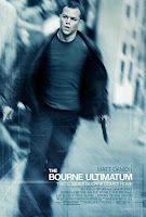
I followed this Photoshop Essentials tutorial on how to make a photo look like the Bourne Ultimatum movie poster.

Here's a copy of the movie poster with Matt Damon to show what the effect looks like:


The technique uses a motion blur filter on everything except the subject. Also, the image is colorized, and a noise layer is blended in to give a slightly gritty look.
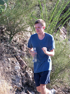
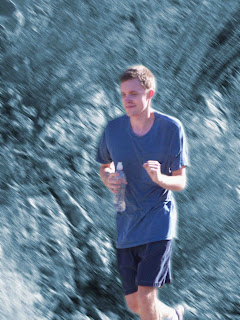
It can be rather time consuming to get this effect because the subject is masked twice. Once to add blur to the background and again to change the color of selected areas.
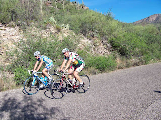
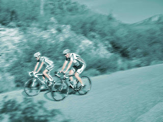
At first I didn't think the photoshopped images looked like they were in motion. But after staring at the a blurred image for a few seconds and then back to the original, the original looks surprisingly stationary.
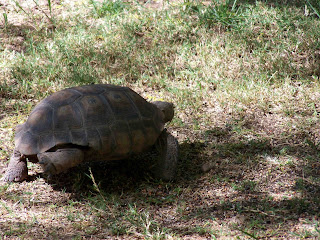
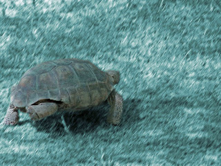
Purposely adding blur and grain to images is a new experience for me. As a beginning photographer, those are the types of things I usually try to avoid. These first exercises in motion blur aren't exactly dazzling, but they have opened up a new realm of possibilities for me.

It is exciting to see what can be done with motion blur. Smashing Magazine shows 45 beautiful examples to amaze and inspire you.

Sunday, July 26, 2009

Pixel Magic

Greetings and Happy Cactus Monday!

I've been playing around with this simple Photoshop trick. A single line of pixels is selected and then pulled using Ctrl+T. This technique works vertically as well as horizontally. The stretched sections can be moved, and the canvas enlarged, if desired. These are some of my experiments:

Red Bird Of Paradise

There is something about viewing altered images that gets creative juices flowing. Hopefully I've included enough cactus examples to provide color and design inspiration for cactus lovers as well as art and nature enthusiasts.

Budding Barrel Cactus

Prickly Pear Fruit

House Finches in Red and Orange

March Ocotillos

Purple Prickly Pear

Cactus Wren

Azurite and Malachite

Creosote Seeds

Sunset
I learned about this process from an article by Evad at Colourlovers.com. Click here for some stunning examples of Single Pixel Color Inspiration from Photos.

Visit Teri's Painted Daisies to see more Cactus Monday posts.